

The web as we know it is over 20 years old. As with anything that grows, the world wide web has changed dramatically over the last two decades. Like the internet, website design techniques constantly evolve to enhance the user experience.
While not all of the upcoming trends may be appropriate for your website redesign or audience, it’s good to know what’s available and popular so you can effectively and efficiently reach your visitors.
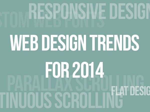
2014 Website Design Trends
Parallax scrolling:
Parallax scrolling brings websites to life while adding depth to images and text. Examples of this technique include changing graphics or animations so that they start to play as you scroll past them on a page.
This scrolling technique implements HTML5 and CSS3 for a low-cost, cosmetic design solution that can boost the wow-factor of your site.
Single page design:
Websites usually have a handful of pages that you can access using navigation links. Smaller sites with less content are easing away from this model to a simpler one, incorporating images and content onto a single web page.
Single page design often utilizes parallax scrolling so visitors do not have to search through many pages to find the most important information.
While this trend is great for removing unnecessary clutter, it may not be the best if your site is content-rich, or if you are aiming to increase its SEO.
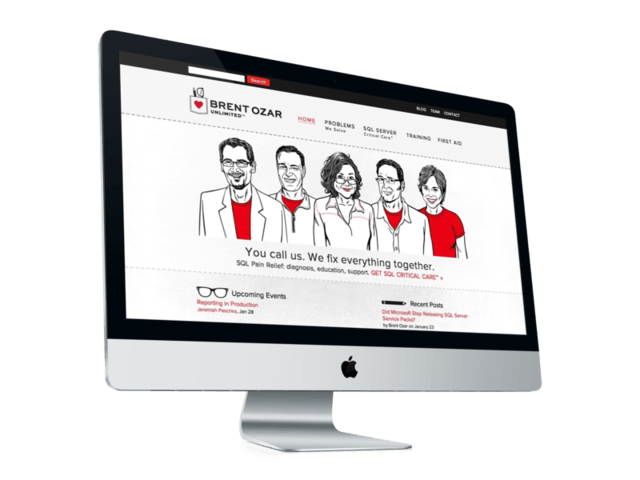
Fixed headers
The hot trend in 2014 for content-rich websites is a fixed header bar at the top of the page. A fixed header stays put on a browser window and doesn’t disappear as a visitor scrolls down the page. This technique makes it easier to navigate between pages within the site instead of scrolling back to the top of the page.
Responsive website design
Responsive design streamlines the process of designing a website for both desktop and mobile, ensuring that the website content looks consistent and works seamlessly for all device sizes.
Flat Web design
Windows 8, Facebook and Gmail all use it —- a flat Web design and user interface that capitalizes on simplicity. Flat design does away with heavy gradients, shadows, unnecessary decorations, three-dimensional effects and images that don’t add value to the content.
Instead, the emphasis is on bold lines, creative typography and saturated colors. This design technique offers a cleaner look for content that’s easier to scan and process. Flat design can enhance a website’s responsive design and allow pages to load faster.
Larger Font Sizes
While 12-point font is great for school papers, it can be difficult to read on a computer screen and seemingly impossible to see on some mobile devices. 2014 is the year when website redesigns will include larger text that’s attention-grabbing, readable and easier on the eyes.
A solid, focused web design is more important than a trendy one that doesn’t serve a purpose. As you plan your changes with a web designer, take into consideration your goals for the site, your company’s objectives and values, and key conversion points that you want to enhance.
Cameron Madill
sitepoint.com